# Advanced Blocks
| Block | Icon | Function |
|---|---|---|
| Menu | menu | Create and manage menus and submenus |
| Slider | collections | Create advanced sliders for presentations |
| Flipcard | flip_camera_android | Advanced flipcards |
| Popup | web_asset | Configurable popups |
| Form | call_to_action | Create a form |
# Menus
With the Menu element you can create custom menus in your block.
| Type | Icon | Function |
|---|---|---|
| Horizontal | menu | Horizontal menu |
| Vertical | menu | Vertical menu |
After adding a menu to your blocks right click to open the menu settings
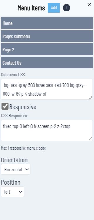
# Menu Items
To add a menu item click on the Add button. All menu items are listed with a dark gray background.
Click on a menu item to edit
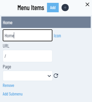
Input the menu item label that will be displayed. Click on Icon if you want to use an icon instead of simple text.
# URL
Digit the url if you are setting an external link.
# Page
You can assign a link to an existing Article in your Strapi.
If you don't see the article you are looking for click on the reload icon
# Remove
To remove the item click on the Remove link
# Add Submenu
MOKAStudio supports one-level submenu (at the moment). Click to add a submenu item. Repeat for each item you need to add to a submenu.
# Submenu CSS
At the moment you need to input the classes for the submenu. MOKAStudio sets some default initial classes. Customize as per your needs.
Next version will have a custom menu designer to create advanced menus
# Responsive
If your menu has to be responsive checkout.
# CSS Responsive
Custom css for the responsive menu
NUXPRESSO will automatically convert a Responsive menu with a hamburger icon menu at the top-right of the screen that will activate a menu based on the CSS Responsive defined.
# Orientation
You can switch a menu from Vertical to Horizontal or viceversa
# Position
Set the alignment of the menu (left,center,right)
# Default settings for responsive menus
Extra settings are available in Settings > Website
| Setting | Description |
|---|---|
| Responsive Menu Class | Add custom class to the responsive menu |
| Responsive menu transition | Add custom transition to responsive menu (default fade) |
# Drag&Drop
First level menu items support drag&drop to reorder the menu.
# Sliders
Sliders are used to create advanced presentations on your website.
To create a Slider
- go to Blocks > Sliders and click on Create New button
- give a name
- set the category to Slider
- enter a description
- click OK.
A new slider will be created and will be listed in the gallery.
Open the editor clicking on the edit icon
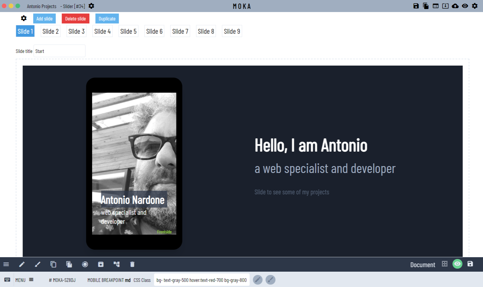
| Option | Description | Shortcut |
|---|---|---|
| settings | Slider general settings | |
| Add slide | Add a new slide | |
| Delete slide | Delete the current slide | Alt + r |
| Duplicate slide | Duplicate the current slide | Alt + d |
# Slide selector
To edit/design a slide click on the relative button. Buttons are automatically added.
You can also reorders your slides with drag&drop the slide you need to move to the new position.
# Slide title
You can assign a title for each slide. We will see later the usage of the slide title
# Slide design
A slide is managed as any other block, with the same functionalities and options. You can create blocks, elements depending on your design.
If your slides have the same layout design my suggestion is to create the first slide with your layout and elements you need, then click Alt + d to duplicate.
# Slider settings
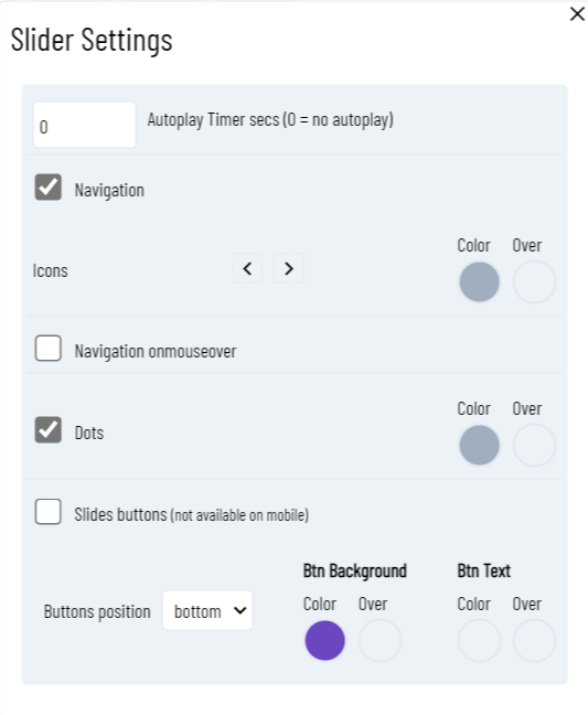
| Option | Description | Notes | Mobile |
|---|---|---|---|
| Autoplay | Set the time delay (secs.) between each slide | Set 0 for no autoplay | Yes |
| Navigation | Enable navigation icons | Yes | |
| Icons | Select the icons you want to use as navigation control | Yes | |
| Color/Over | Assign the color and over color to the icons | over is available if onmouseover enabled | Yes |
| Navigation onmouseover | Enable the mouseover color change | NA | |
| Dots | Enable dots navigation | Not available on mobile breakpoint | |
| Color/Over | Assign the color and over color to the dots | No | |
| Slides buttons | Enable navigation thru buttons | Button will get the slide name/title text. | No |
| Buttons position | Set the button position ( top or bottom) | No | |
| Btn Background | Set button background and background over color | No | |
| Btn Text | Set button text and text over color | No |
# Mobile devices
MOKAStudio sliders supports the following mobile behaviors:
- swipe right : next slide
- swipe left : previous slide
# Flipcards
Flipcards are elements created to improve the user experience. Every Flipcard has 2 sides.
You can edit any side adding any block or element.
# Flipcard select side
A flipcard has the following symbol/icon flip_camera_android
When selected moving the mouse to the bottom left corner of the flipcard a floating bar will be displayed:
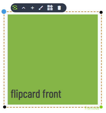
Background color has been set for demo purpose
This tells you that you are in the front side. To switch to back side click on the floating bar that automatically will be updated at
# Add elements
Depending on the current side selected clicking inside the area a container (flexbox) will be selected. You can start to add elements. You can also change any setting (customize) of the container like any other block.
A flipcard is like any other block that differs only that has 2 containers at the same position. The backside is initially rotate to -180deg with backface visibility to hidden.
# Behaviors
Flipcards have a standard behavior :
- mouseover : show back side
- mouseleave : back to the front side
# Popups
Popups are created adding a popup element to your block. A popup is managed like any other block the only difference is that you can set some extra settings
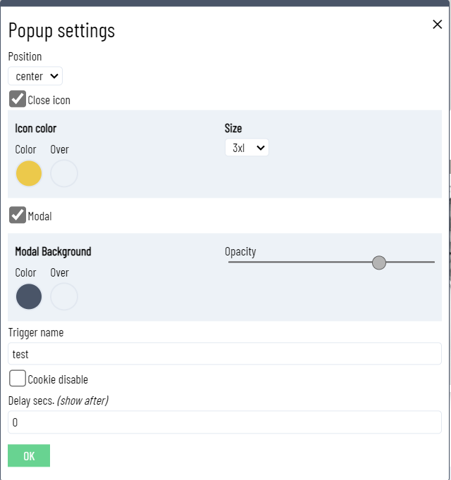
| Setting | Function | Notes |
|---|---|---|
| Position | Screen position | Center, top and bottom positions available |
| Close icon | Display a close icons close | Close the current popup |
| Icon Color | Icon color | |
| Icon Size | Icon size | |
| Modal | Create a modal | With a modal create a full screen modal background |
| Modal Background | Modal background color | |
| Opacity | Modal background opacity | |
| Trigger name | Set an anchor name ie. mypopup | Popup will be triggered when a link is #popup?mypopup |
| Cookie disable | Popup will be activated only if a cookie is not present. If not present a cookie will be created | |
| Cookie name | Cookie name to enable/disable the popup | Setting a cookie name the popup will be activated only when is not present |
| Cookie expires | Set the cookie expiration in days | |
| Delay | You can set a delay time to activate the popup | secs |
# Trigger a popup with any element
You can trigger a popup with any element by setting the link to
#popup?<popup_anchor_trigger>
# Forms
Forms are designed to send data to a remote endpoint. The remote endpoint can be any valid url able to process the incoming request.
You can set a default endpoint in nuxpresso with an environmental variable FORM_SENDER.
# Form settings
After you create a form you can access to the settings clicking on the settings from the floating bar.
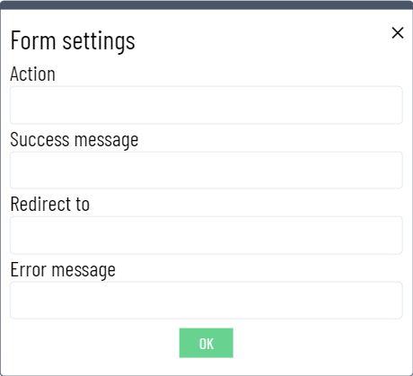
| Setting | Function | Notes |
|---|---|---|
| Action | Endpoint URL | URL where the form will be posted |
| Success message | When the form is submitted succesfully | Endpoint response code 200 |
| Redirect to | URL to redirect after the form is submitted | Only if form has been submited with no errors |
| Error message | Error displayed when the endpoint URL return an error |
# Form fields
Add any available field to your form selecting from the available elements.
# Creating a simple contact form
- Add a text element and set the text i.e. Firstname
- Add an input element (text), right click to access to the customizer
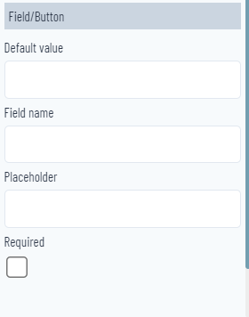
| Setting | Function | Notes |
|---|---|---|
| Default value | Add a default value | |
| Field name | field name must correspond to the field that processes the form | |
| Placeholder | Placeholder value | |
| Required | Check if the field is required |
# Form validation
MOKAStudio uses a simple validator to validate your form before to submit, with simple messages of the missing or wrong input by the user.
← Blocks Block Editor →