# Block Editor
# Editor Dashboard
The Editor Dashboard is the place where you create, update your blocks.

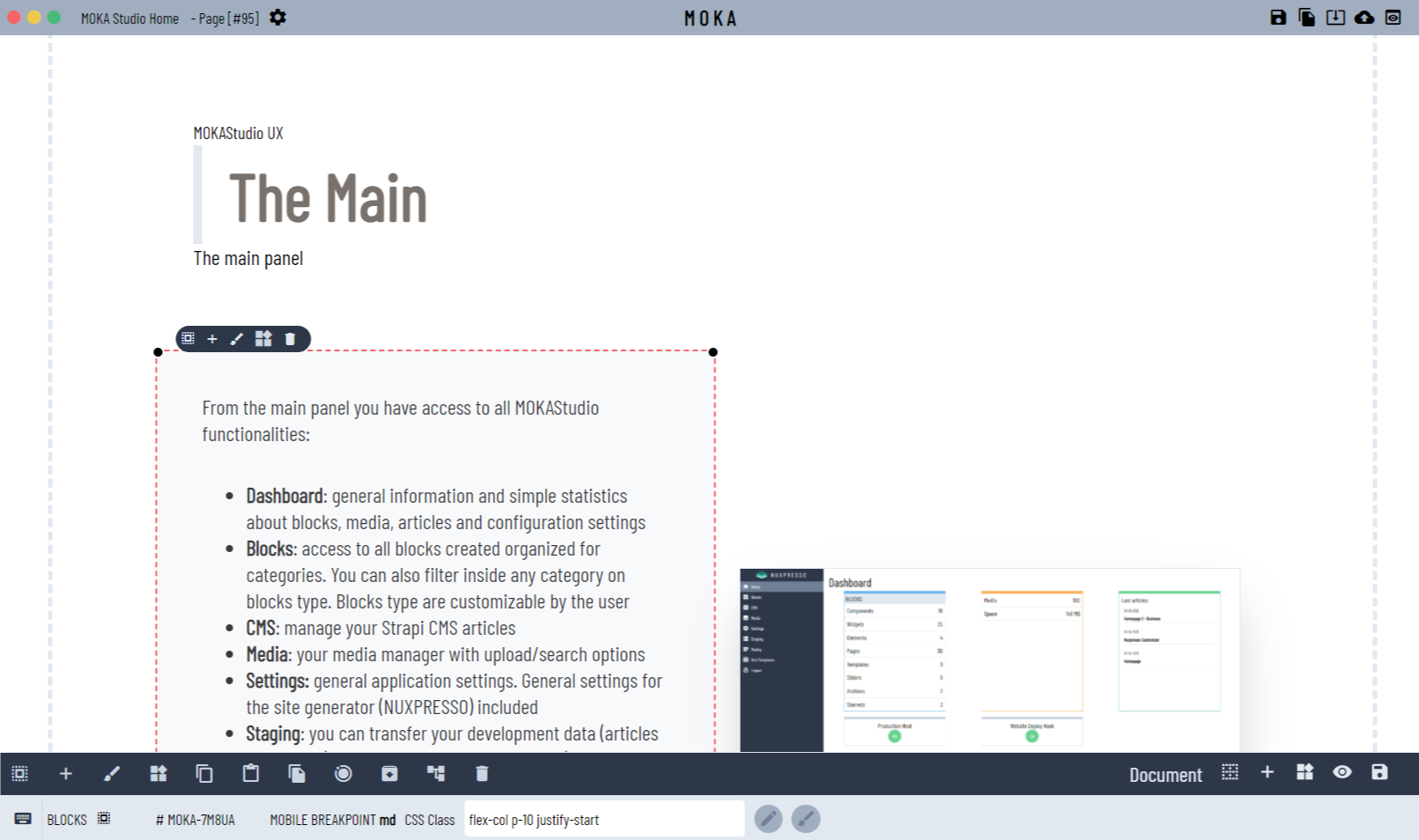
It's a WYSYWYG dashboard organized as follows:
- topbar
- design board
- toolbar
- status bar
# Document
Since a block can be a set of blocks we refer to a document as the global block that is composed of different blocks
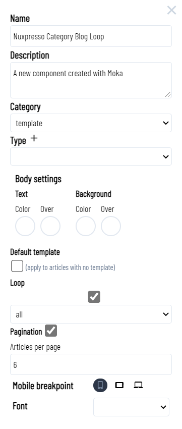
# Document settings
Click on the settings located on the Topbar after the block title to open the document settings.

# Name
Document name
# Description
Document description
# Category
Assign a category to the document
- widget
- page
- template
- slider
- component
- archive
- favorite
# Type
assign a type to the document
You can define your types clicking on the add icon
# Body settings
You can assign the body colors for text and background
# Default template
When checked any article with no page/template assignment will use the document/block checked as default.
# Loop
When checked any loop page (list of articles) will use the template. You can set which url will serve the template. The url available are :
- all : any loop page (/articles) will use the current template
- example.com/articles
- example.com/articles/category/your_category
Nuxpresso create by default the following friendly urls for loops:
- your_domain/articles : list of articles
- your_domain/articles/category: list of articles by category
(option available only for templates)
# Pagination
Enable the pagination per loop templates (option available only for templates)
# Articles per page
Number of articles listed in the loop (option available only for templates)
# Topbar

The Topbar is set to:
| Icon | Function |
|---|---|
| fiber_manual_record | close the current editor window clicking on the icon at the top left of the window |
| fiber_manual_record | select: select the current document clicking on the icon |
| fiber_manual_record | preview full preview of the current document clicking on the icon |
| settings | document settings |
| save | save |
| file_copy | duplicate or save as |
| web | create a new article that will use the document as layout |
| system_update_alt | import a reusable block |
| backup | export the current document to file (JSON) |
| remove_red_eye | preview preview the current document |
# Design board
The design board is where the blocks are placed. When you create a new block MOKAStudio automatically create an empty container with a simple text element. It's important to understand the structure that MOKAStudio uses to represent a block and create the correspondent HTML code.
Please read the Block Structure documentation before to proceed.
When blocks are added to the design board, moving the mouse over any block/element a colored dashed border will be displayed. The color codes are:
Clicking on a container/block the border will stay visible, indicating that that block is a current selected one.
# Tip
Sometimes elements overlaps so the floating bar icons are not cliccable Use the toolbar or the keyboard shortcuts
When you have a selected element you also have:
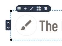
a floating bar showing at the top left corner of the element itself
a toolbar at the bottom of the screen
# Floating bar

Depending on the element selected the floating bar as different icons as a shortcut for common functions. Following icons/actions are available for all elements
| Icon | Function | Shortcut |
|---|---|---|
| view_columns | indicates the element type. Clicking on the you can replace the element with another type (all data of the current element will be removed) | |
| expand_less | move element up (you can use also the black dot on the right upper corner) | |
| edit | (not available for containers) : depending on the current element the edit action can be : edit the text, add image or select icon | Alt + w |
| brush | opens the customizer panel where you can customize your element attributes assigning the TailwindCSS pseudo-classes | Alt + z |
| delete | removes the element from the design board. A confirmation modal will be displayed. | Alt + r |
If the selected element is a container you will have also the following icons/actions
| Icon | Function | Shortcut |
|---|---|---|
| add | add an element to the current selection selecting from the elements drawer | Alt + i |
| widgets | add a reusable block to the current selection selecting one from the reusables block drawer | Alt + u |
# Toolbar
The toolbar is fully available when a block is selected.

The toolbar gives you the tools to for the current selection (left side of the toolbar):
| Icon | Function | Shortcut |
|---|---|---|
| add | add an element (available only for containers) | Alt + i |
| edit | edit the current element content (not available for containers) | Alt + w |
| brush | customize the current element design | Alt + z |
| widgets | add a reusable block (available only for containers) | Alt + u |
| content_copy | copy the current element in the clipboard | Alt + c |
| content_paste | paste the copied element to the current element | Alt + v |
| file_copy | duplicate the current element | Alt + d |
| motion_photos_on | set the animation for the current element | Alt + a |
| archive | save current block as reusable block | |
| account_tree | display the current element/block tree | Alt + t |
| delete | remove the current element/block | Alt + r |
On the right side of the toolbar you have tools for the global document
| Icon | Function | Shortcut |
|---|---|---|
| select_all | select the document | |
| add | add a new block to the document | Alt + i |
| widgets | add a reusable block to the document | Alt + u |
| remove_red_eye | preview | Alt + b |
| save | save the document | Alt + s |
# Status Bar
The status bar gives you info about the current selected element.

# Input custom classes
You can input your custom class in the CSS Class input field. This can be useful when you need to define specific classes (responsive values)
From the Status Bar you can also view/update the CSS Classes for the current element.
| Icon | Function | Shortcut |
|---|---|---|
| edit | open the CSS classes editor and style editor for the element | |
| brush | open the Customizer | Alt + z |
# Animations
MOKAStudio includes support to GSAP (opens new window) animation engine by Greensock.
Thus means that you can assign animations to any block/element directly from the block editor.
I created a set of most common animations ready to use.
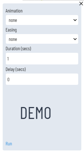
To assign an animation to a selected block/element click on the motion_photos_on from the Toolbar or press Alt + a

# Animation settings
| Field | Function | Notes |
|---|---|---|
| Animation | select an animation from the list | MOKAStudio comes with a set of preset animations. You can add, update or remove them as stated below. |
| Easing | select an easing settings from the list | Presets |
| Duration | set the animation duration in secs | Will be fired when the item is not off the screen |
| Delay | set the animation delay (0=plays immediately) | Will be fired only if item is not off the screen |
# ScrollTrigger
MOKAStudio animations supports the GSAP ScrollTrigger plugin.
Thus means that the animation will not be fired when the element if off the screen but only when it is visible.
# Add animations
You can add your custom animation updating the file
Path - ./src/plugins/animations.js
// ---- YOUR ANIMATIONS GO HERE ---


gsap.registerEffect({
    name: "myanimation",
    effect: (targets, config) => {
        return gsap.fromTo(targets,
            {
                scale:0,
                opacity:0
            },
            {
                scale:1,
                opacity:1,
                duration: config.duration,
                ease: config.ease,
                delay: config.delay
            }
        );
    },
    defaults: {duration: duration, delay:0, ease:"power1" }, //defaults get applied to any "config" object passed to the effect
    extendTimeline: true, //now you can call the effect directly on any GSAP timeline to have the result immediately inserted in the position you define (default is sequenced at the end)
});


// --- END OF YOUR ANIMATIONS ---

...
Update const gsapEffects array adding your animation/s name.
// ADD YOUR ANIMATION name to the gsapEffect array
const gsapEffects = [ 'fade' , 'scale' , 'scale-in' , 'flip-x' , 'flip-y' , 'slide-left' , 'slide-right' , 'slide-top' , 'slide-down', 'rotate' , 'rotate-scale' , 'rotate-hover' , 'grow-width' , 'width-reverse' , 'close-left' , 'close-right' , 'grow-height' ]
The const gsapEase are the easing modes available in GSAP. Do not change it.
Learn how to write your own animations from the official GSAP documentation (opens new window)
# Keyboard shortcuts
# Selected element shortcuts
| Keyboard | Shortcut |
|---|---|
| Alt + q | add element (only containers) |
| Alt + i | add element (only containers) |
| Alt + u | add reusable block (only containers) |
| Alt + m | move current element up |
| Alt + d | duplicate element |
| Alt + w | edit content / add image |
| Alt + z | open the Customizer |
| Alt + r | remove element (confirmation required) |
| Alt + c | copy current element to the clipboard |
| Alt + v | paste the copied element to the current element (must be a container) |
| Alt + g | copy the design settings to the clipboard (CSS classes) |
| Alt + h | paste the design settings copied before and apply to the current element |
| Alt + o | create image of current element |
# Editor shortcuts
| Keyboard | Shortcut |
|---|---|
| Alt + s | save block |
| Alt + b | preview |
# Preview shortcuts
| Keyboard | Shortcut |
|---|---|
| Alt + s | save block with image preview |
| Alt + x | close preview |
| Alt + k | display rendered HTML markup |